Color Palette Revealed: Discover the Color Psychology Behind Branding
In the dynamic world of marketing, a brand’s visual appeal plays a vital role in winning the hearts of your audience. An important but often overlooked aspect of this visual stimulation is color psychology. The psychology behind color goes beyond aesthetics; it touches the subconscious, triggers emotions and affects perception.
Join us on a colorful journey to discover the color psychology behind red, orange, yellow, green, blue, purple, pink, brown, black, white and gray, and learn how these hues shape brand image and consumers interactive.
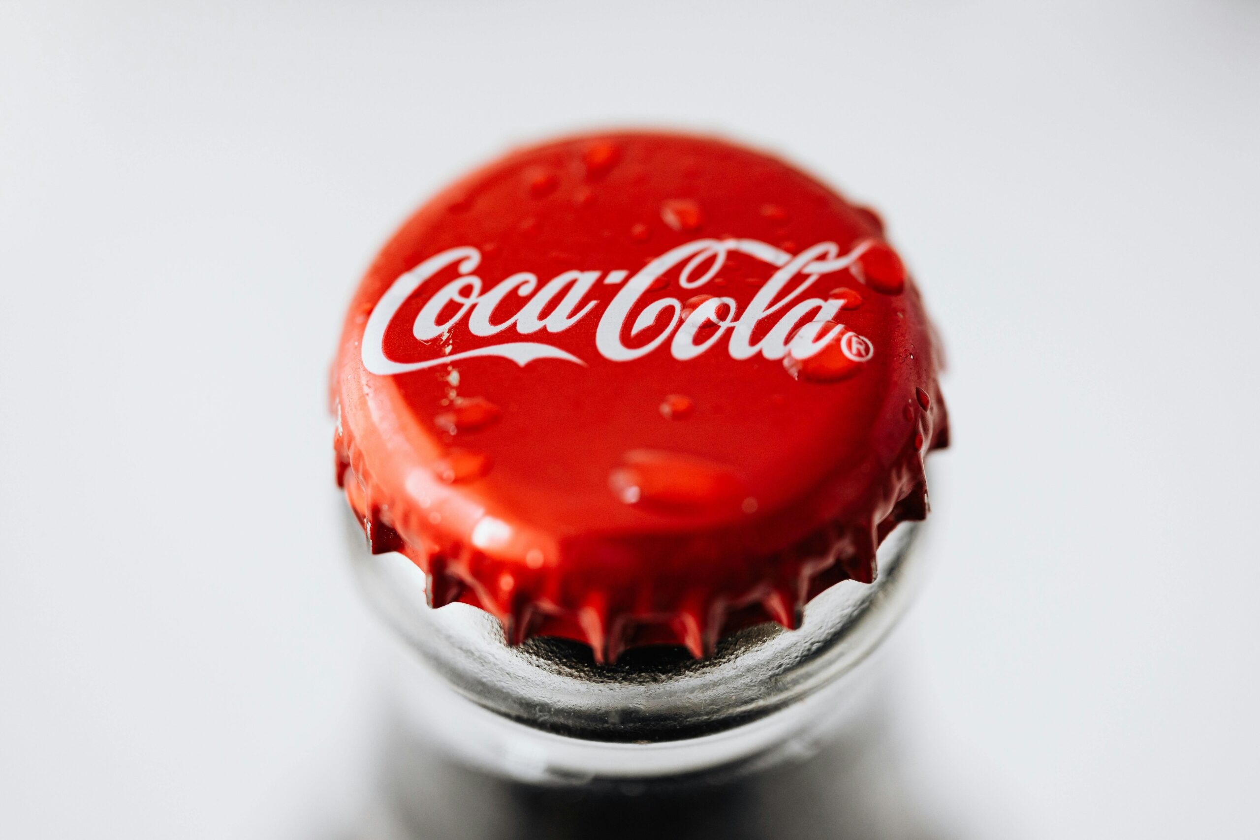
Red: The Bold Power of Passion and Urgency
Emotions: Passion, energy, love, urgency
Marketing Implications: Capturing attention creates a sense of urgency associated with strong emotions.
Red is not just a color; This is a statement. Brands like Coca-Cola and Target use their bold ethos to make a lasting impression and convince consumers to take immediate action.
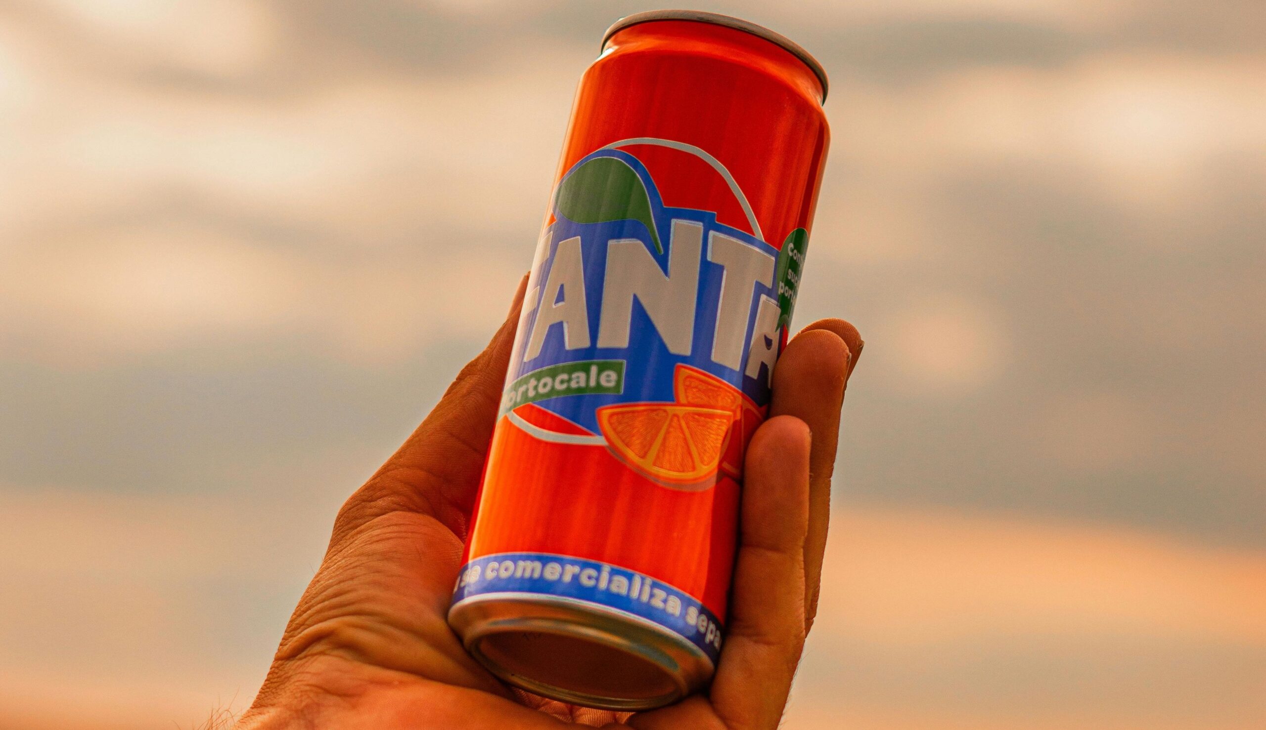
Orange: A warm embrace of energy and enthusiasm
Emotion: Warmth, enthusiasm, creativity
Marketing Meaning: Vibrant and entertaining, often economical and popular when promoting food and outdoor activities.
Orange exudes positivity and excitement. It is the color of choice for brands that want to add warmth and creativity to their messaging. Think Soundcloud and Nickelodeon.
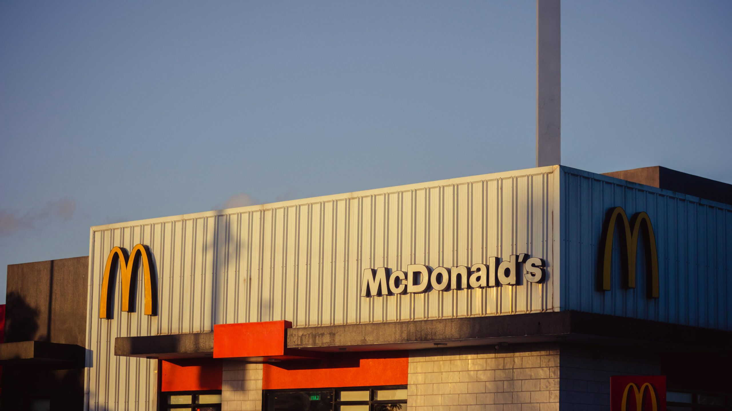
Yellow: Harness the power of happiness and positivity
Emotion :Happy, positive, clear
Marketing significance: Attract attention, create a happy and optimistic atmosphere, and highlight discounts and special offers.
Yellow, the color of sunlight, is a beacon of joy. Brands like McDonald’s and IKEA use brightness to create a friendly, inviting atmosphere.
Green: Nature’s Color Palette for Health and Growth
Emotions: Nature, health, growth
Marketing Meaning: Refers to environmentally friendly products that provide a feeling of freshness and calm, common in the health and wellness industry.
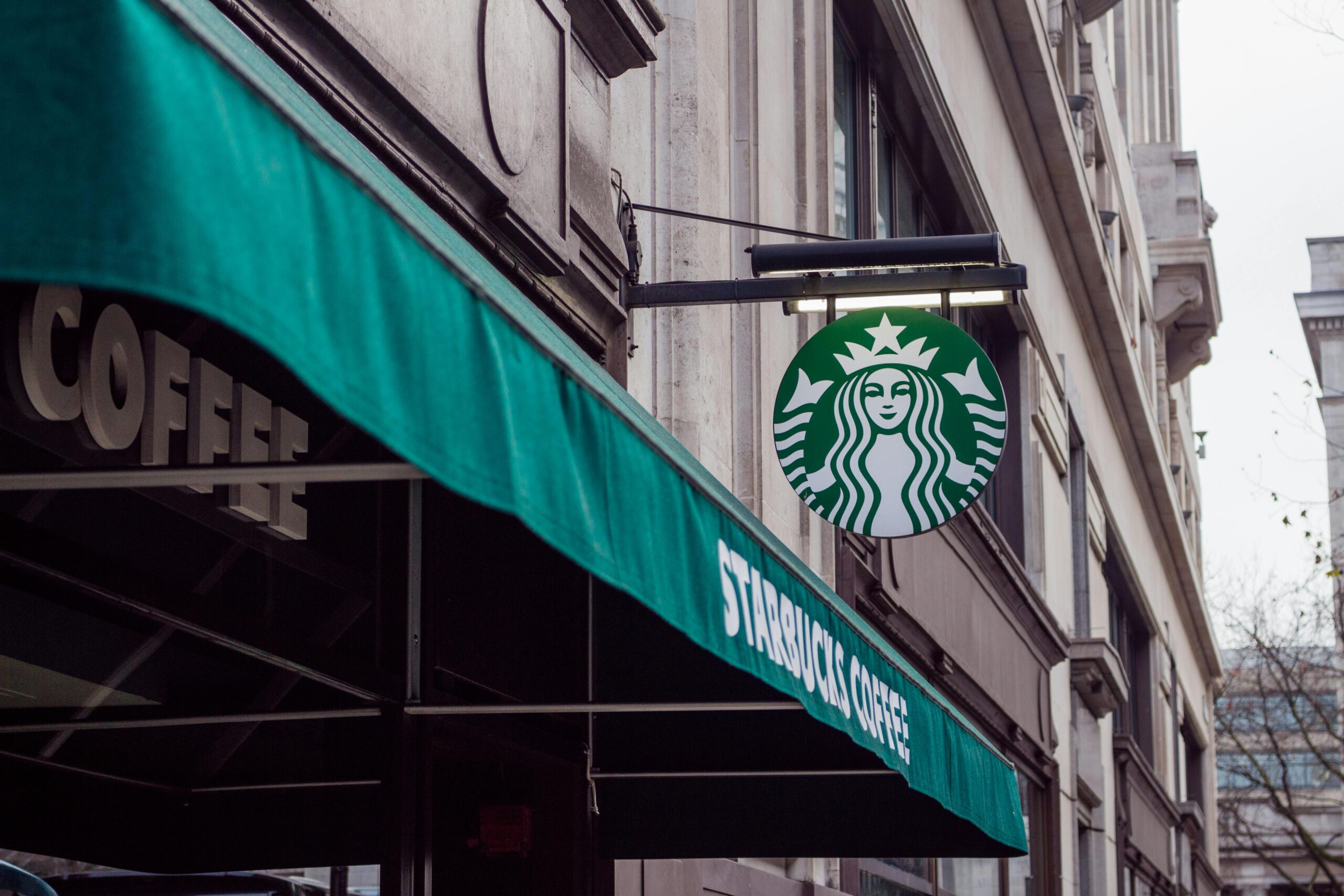
Green is a favorite color for brands that value sustainability and health. starbucks and Tropicana use the color green to communicate their commitment to nature and health.
Blue: The trustworthy sea of calm and professionalism
Emotion: Trust, calmness, professionalism
Marketing Impact: Promote trust among corporate and financial brands commonly associated with technology and social media
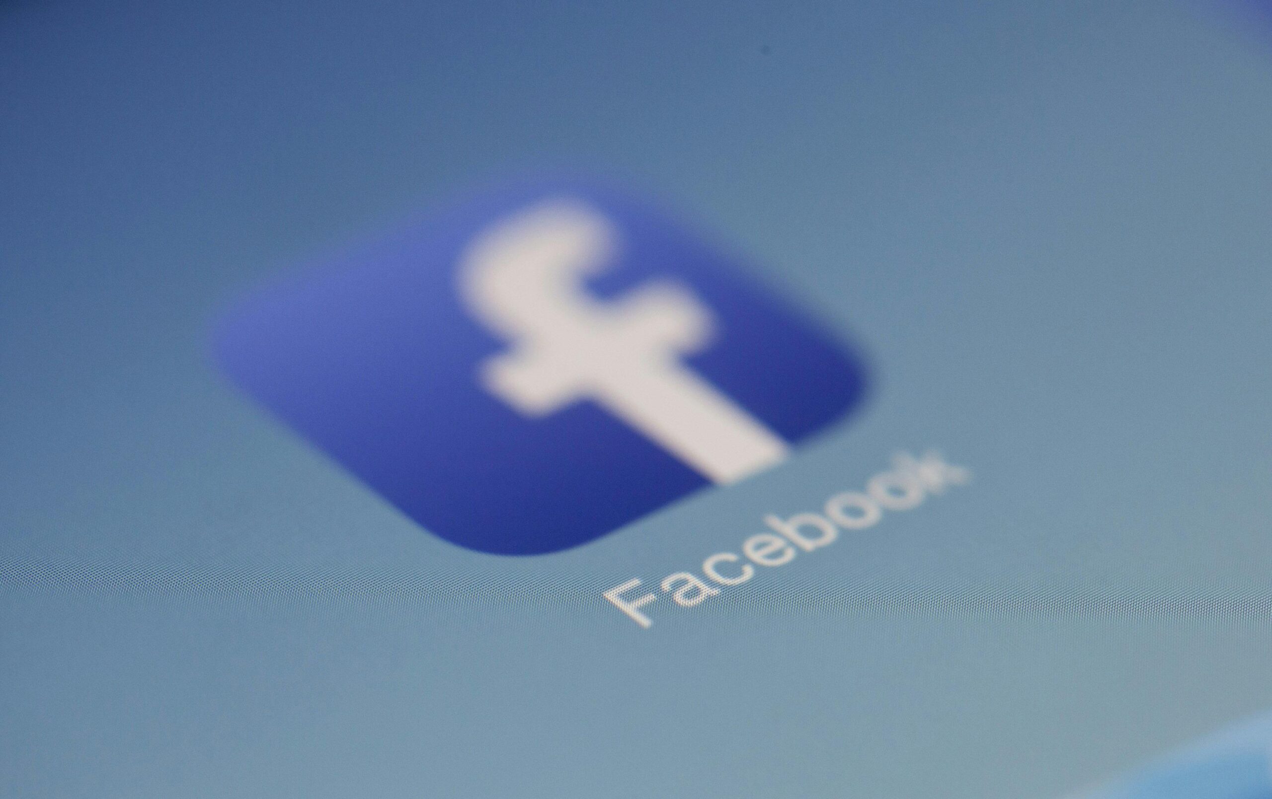
Blue exudes reliability and professionalism. Brands like Facebook and Twitter use its calming effects to build trust and credibility online.
Purple: Royal elegance of luxury and creativity
Emotions: Royalty, luxury, creativity
Marketing Meaning: stands for sophistication and is often used in beauty and anti-aging products to convey a unique feel.
Purple represents wealth and creativity. Brands like TWITCH and Yahoo use purple to add a touch of royalty and uniqueness to their images.
Pink: A playful symphony of sweetness and romance
Emotion: Sweet, playful, romantic
Marketing Significance: Targeted at a teenage audience, often used in children’s products and cosmetics to evoke feelings of warmth and caring.
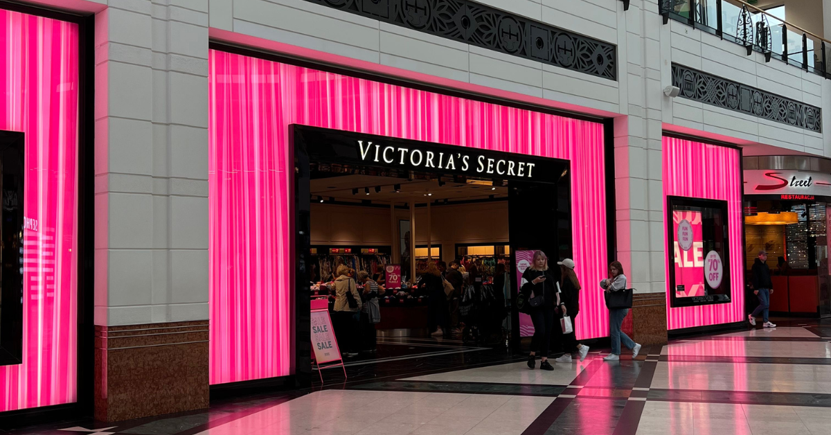
Pink isn’t just for princesses. It is a versatile color that conveys a playful and soulful feel. Barbie and Victoria’s Secret are prime examples.
Brown: Stable, simple earth tones
Emotion: Simple, stable, warm
Marketing Meaning: Commonly used in the food industry to convey a sense of reliability and comfort, and to represent simplicity and durability
Brown is often associated with the earth and represents reliability and comfort. Brands like UPS and Hershey use brown to convey a sense of trust and simplicity.
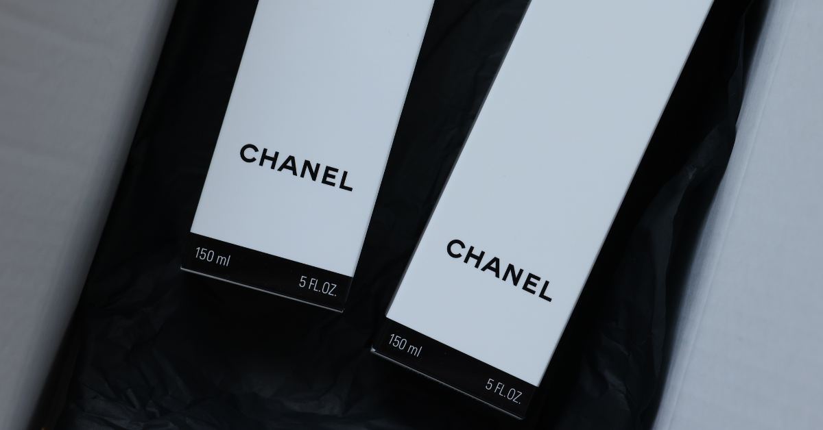
Black: an elegant aura of strength and sophistication
Emotion: Elegance, power, maturity
Marketing effect: Appear with luxury brands. Create a unique feel. Often used to evoke a timeless and classic feel.
Black is the epitome of elegance and timelessness. Luxury brands like Chanel and Rolex use black to convey elegance and exclusivity.
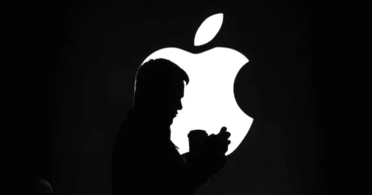
White: a simple and clean pure canvas
Emotion: Pure, simple, clean
Marketing Significance: Create a simple and modern look, often used in the healthcare and technology industries, to represent a new beginning.
White symbolizes purity and simplicity. Brands like Apple and Nike use white to create a clean, modern aesthetic that emphasizes new beginnings or new beginnings.
Grey: A neutral base color for balance and sophistication
Emotion: Neutral, balanced, mature
Marketing Significance: Conveys a sense of professionalism common in corporate branding and can be used as a background to highlight other colors.
Gray is the unsung hero of neutrality and balance. It provides a subtle background against which other colors stand out. Think Mercedes and Honda.
In the kaleidoscope of marketing, the color psychology is a language that speaks to consumers on an emotional level. Each color has its own meaning and association, allowing brands to create narratives that resonate with their audiences.
By understanding the psychological nuances of color, companies can create a vibrant and memorable brand image and create connections that go beyond the superficial. So the next time you’re thinking about your brand’s color scheme, remember: it’s not just about aesthetics, it’s also about the emotions you want to evoke and the story you want to tell.